CSS object-fit
?️ CSS object-fit
? Quick Overview
The object-fit property controls how an image or video is resized to fit inside its container box. You can decide whether the media should stretch, maintain aspect ratio, crop, or scale down.
It only works on replaced elements such as <img> and <video>, not on normal containers like <div>.
? Key Concepts
object-fitdefines how the content (image/video) fits inside its box.fill(default): stretches to fill the box, may distort the image.contain: fits entirely inside, keeps aspect ratio, may leave empty space.cover: fills the box while keeping aspect ratio, cropping the overflow part.none: no scaling, image keeps its original size.scale-down: similar tononeorcontain, whichever makes the image smaller.
Along with object-fit, we often use object-position to decide which part of the image remains visible when it is cropped.
| Property | Description | Example Values |
|---|---|---|
object-fit |
Defines how the content fits inside its container | fill, contain, cover, none, scale-down |
object-position |
Aligns the content inside the container | center center, top left, bottom right, 50% 25% |
? Syntax / Theory
Basic syntax for object-fit with a fixed-size image box:
? View Code Example
// Make an image fill a fixed-size box without distortion
img.card-image {
  width: 200px;
  height: 150px;
  object-fit: cover;
}
Combining object-fit with object-position to control the visible area:
? View Code Example
// Focus on the top of the image while cropping
img.hero-image {
  width: 100%;
  height: 250px;
  object-fit: cover;
  object-position: top center;
}
? Live Visual Examples
Same kind of images, each using a different object-fit value inside the same-sized box:
? How different object-fit values behave
The boxes below all have the same width and height. Only the object-fit value changes.
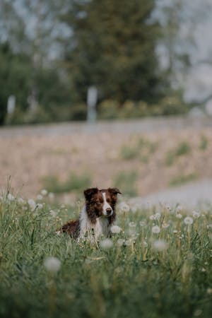


Notice how:
fillstretches the dog image, distorting it.containkeeps the full image but leaves empty space.coverzooms in and crops edges to fill the box.noneshows the image at its original size; it may overflow or be clipped.scale-downpicks the smaller result ofnoneorcontain.
? Controlling the Visible Area with object-position
When using object-fit: cover;, part of the image gets cropped. The object-position property decides which part stays visible.
? Same image, different focus points
If you provide only one value (for example, left), it sets the horizontal position and the vertical position defaults to center.
? View Code Example
// Profile picture: always show the face near the top
.avatar {
  width: 120px;
  height: 120px;
  border-radius: 50%;
  object-fit: cover;
  object-position: top center;
}
? Tips & Best Practices
- Use
object-fit: cover;for cards, banners, and thumbnails where the box must be filled. - Use
object-fit: contain;when you must show the entire image (logos, diagrams, icons). - Combine
object-fitwithobject-positionto keep important content (like faces) visible. - Perfect for responsive profile images, gallery thumbnails, and video previews.
? Try It Yourself
- Create a square container of
200px × 200pxwith an image inside. Try allobject-fitvalues (fill,contain,cover,none,scale-down) and observe the differences. - Use
object-fit: cover;and experiment withobject-positionvalues liketop,bottom right, and50% 25%to focus on different parts of the image. - Try applying
object-fiton a<div>and confirm that it has no effect. Then move the same background image into an<img>tag. - Build a small gallery where each image uses a different combination of
object-fitandobject-position. Label each card with the values used.