CSS Image Filters
? CSS Image Filters
They are perfect for hero images, cards, galleries, and backgrounds without editing the image in Photoshop or Figma.
? Key Concepts
filteris a CSS property that visually processes an element (often an image).- You can chain multiple filters together in one line (e.g.,
grayscale+blur). - Most filter functions accept percentages (like
100%) or unit values (like5px). - Filters affect only the rendered pixels, not the actual image file.
- Filters can be applied to any element, not just images (e.g., containers, cards, background images).
? Basic Syntax
Use the filter property with one or more filter functions:
? View Code Example (Basic Syntax)
/* Apply a single filter function */
selector {
filter: filter-function(value);
}

/* Apply multiple filters at once (executed left to right) */
selector {
filter: filter-function1(value1) filter-function2(value2);
}
? Common Filter Functions
grayscale(%)– converts image to black and white.blur(px)– softens the image (like a Gaussian blur).brightness(%)– increases or decreases overall brightness.contrast(%)– adjusts the difference between light and dark areas.sepia(%)– gives a warm, vintage brown tone.opacity(%)– controls transparency (similar toopacityproperty).
? View Code Example (Common Filters)
/* Different filters applied to different images */
img.grayscale {
filter: grayscale(100%);
}

img.blur {
filter: blur(3px);
}

img.brightness {
filter: brightness(150%);
}

img.contrast {
filter: contrast(180%);
}

img.sepia {
filter: sepia(80%);
}

img.multiple {
filter: grayscale(60%) blur(2px) brightness(120%);
}
?️ Live Output Preview
Below is the same image with different filter effects applied. (The filters here are applied using inline styles to keep the demo self-contained.)
? Visual Comparison
Scroll horizontally if needed. Each image uses a different filter so you can see how the effect changes the mood.
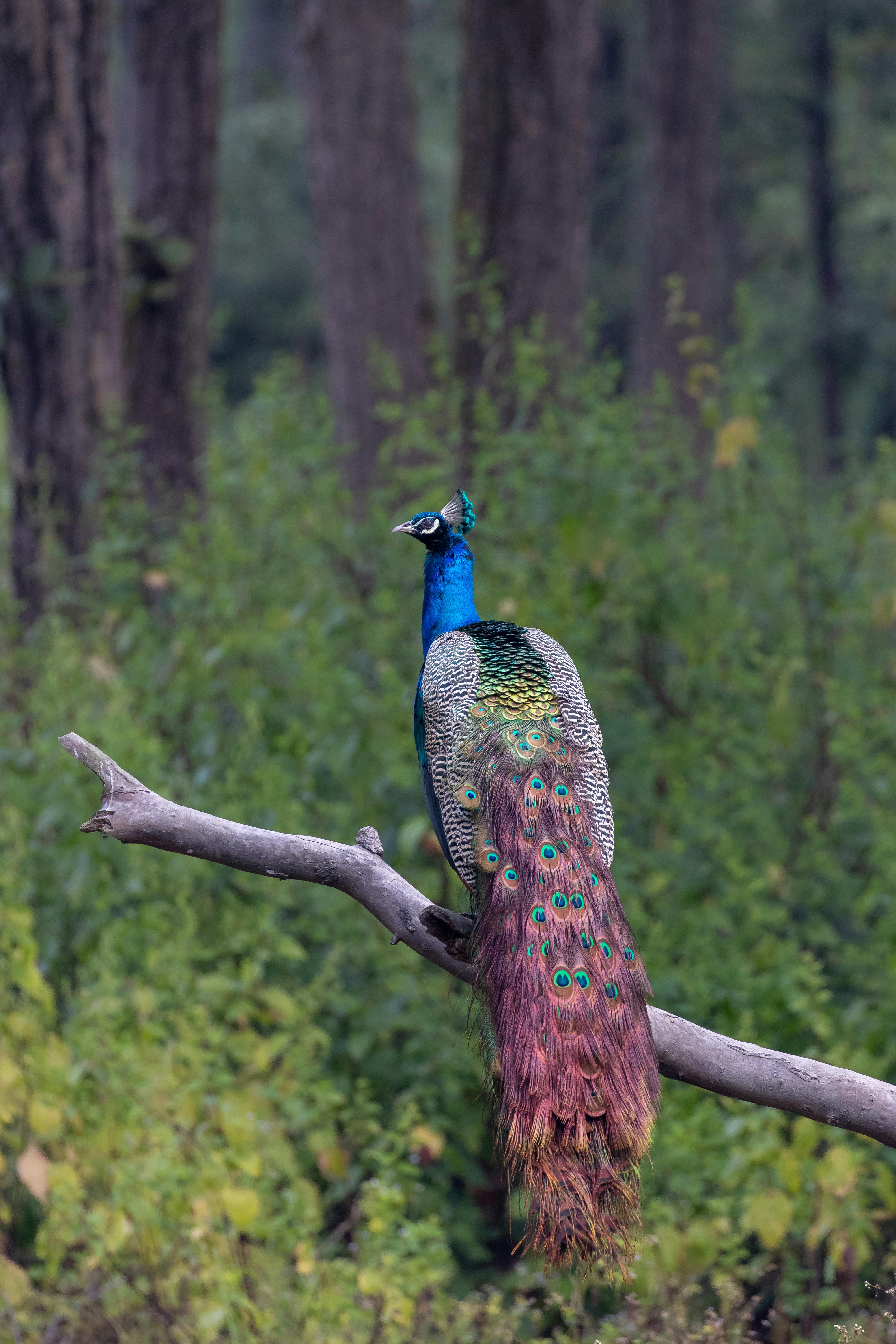
grayscale(100%)

blur(3px)

brightness(150%)

contrast(180%)

sepia(80%)

combined filters
Notice how grayscale and sepia change the mood, while brightness and contrast change how strong and vivid the colors appear. Combining filters gives you full creative control.
⚙️ Practical Usage Example
A common pattern is to show images in grayscale and remove the filter on hover so the image “comes alive”.
? View Code Example (Gallery Hover Effect)
/* Start in grayscale and reveal color on hover */
.gallery img {
filter: grayscale(100%);
transition: filter 0.3s ease;
}

.gallery img:hover {
filter: none;
}
? Tips & Best Practices
- Use
grayscaleorsepiato create classy, minimalist portfolio galleries. - Apply
blurto background images to keep text in the foreground readable. - Combine filters gently (e.g.,
brightness(110%) contrast(105%)) to enhance, not destroy, image quality. - Always test filtered images on both light and dark themes to ensure enough contrast.
- Remember that extreme blur or heavy contrast can make UI elements look broken or out of place.
? Try It Yourself
- Create an image gallery where each image is grayscale by default and turns to full color on hover.
- Build a hero section with a blurred background image and sharp text in front of it.
- Design a “profile card” section where profile pictures use
sepiafor a vintage look. - Experiment with combining
blur,brightness, andcontrastto highlight a call-to-action area. - Apply filters to icons or logos on hover to give subtle visual feedback to the user.